We would essentially build a customizable template that any parish could use to transform their online presence.
How awesome is that??
It was a no-brainer.
Introducing the Xavier theme (named after St. Francis Xavier, arguably the greatest Catholic evangelist in history).
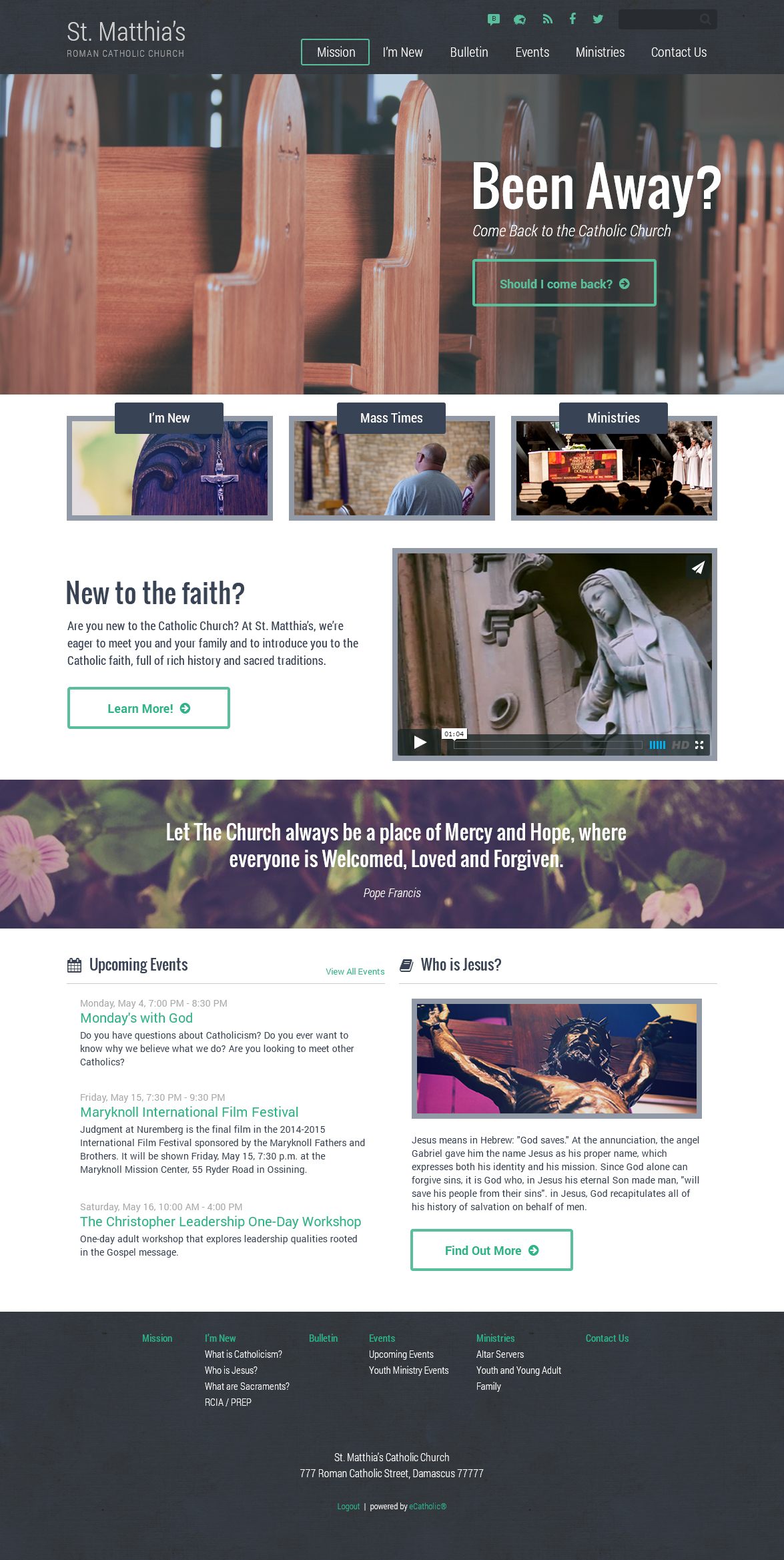
**Click image to enlarge**
Here are some of the main features of the Xavier theme:
1. Built around the New Evangelization.
To me, this is critical. Most parish websites are designed for people already involved in the parish. They’re ad intra, to use Church language. They use insider language (e.g., R.C.I.A. or stewardship) instead of language that would be decipherable to someone who has been away from the church (or someone who has never been Catholic!). Similarly, the content and structure of most parish websites are clearly aimed at the already-involved.
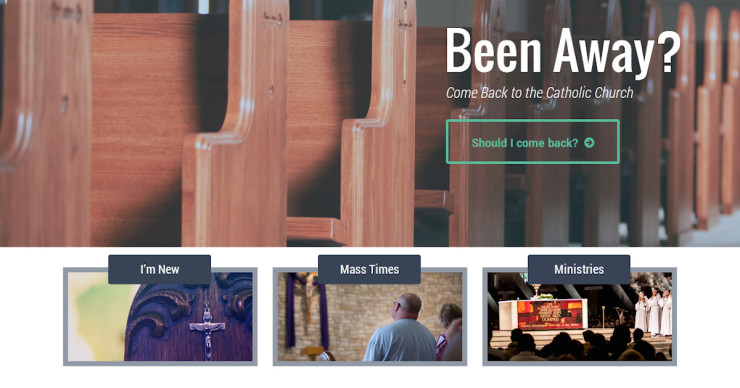
But with the Xavier theme, the primary emphasis is on drawing back those who have been away. The first thing you see, in the giant image slider, is in invitation for fallen-away Catholics to return to the Church. Studies show that most people interested in considering (or reconsidering) the Church first head to Google. They search out nearby parishes, or Catholic websites, and make their decision based on what they find online. In other words, the parish website is often the first impression people have of your parish (and of the Church in general), whether the seekers be returning or new Catholics.
The Xavier theme makes sure that first impression is warm and welcoming. We want the 75% of people who no longer attend Mass each week to know that the main thing our parish cares about is welcoming them back so they can receive all the gifts God wants to give them through his Church.
That welcome starts with the invitation in the main image slider at top. It’s the first thing they’ll see: an invitation to return. But then further down, they’ll also find sections on “New to the faith?” (note: not “Sign up for RCIA”) and “Who is Jesus?”, both of which lead to a subpages with videos and resources from Bishop Barron on who Jesus is and why he matters. The goal is to be evangelistic and Christocentric, and I think we nailed it.
It’s worth noting that the theme doesn’t ignore the already-involved. They can still find everything they need via the menu structures. It’s just that the website doesn’t lead with content for the already-involved. It’s primarily aimed at those who have drifted away. In other words, it’s a website for the New Evangelization.
2. Clear navigation.
Many parishes are convinced they need to throw everything on their homepage. If it’s not on the homepage, they maintain, people will miss it. That’s why the average homepage has 84387972 links and announcements.
And I get that. Part of the problem is that every ministry thinks their events and news are top priority, so they demand to be featured on the homepage. But when you have 100+ ministries who think they’re Priority #1 and jostle for prime attention, nobody ends up prioritized. You just get a mess.
That’s why the Xavier theme features only three big call-to-action buttons on the homepage: “I’m New”, “Mass Times”, and a final one reserved for a single Big Event/Announcement/Feature.
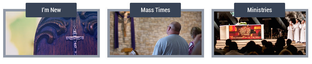
After analyzing the data from thousands of parish websites, eCatholic has determined that, by far, the two most popular reasons people visit a parish website are to find Mass times and to learn more about the parish (who are you? what are you about? where you located?). So those two items should be front and center on every parish website—don’t make visitors hunt for them.
(The “I’m New” button also reinforces the point from the first feature above, that our parish cares, above all, about welcoming people who are new or who have been away a while. It’s our first priority. It suggests that we’ve taken time to create a specific page just for you, because you matter and we want to welcome you back.)
The third call-to-action button can highlight the One Big Thing going on in your parish this week (not the seven big things, not the three big things—the one thing.) Or you might choose to link to a particular ministry, sign-up page, or stewardship initiative from the button. Whatever the case, you can changes the images, headline text, and link to whatever you want. It’s completely flexible.
3. Great Catholic content, front and center.
This is probably my favorite part about eCatholic, in general. Every eCatholic website, regardless of the theme you choose, has built-in “content modules” that allow you to drag-and-drop great Catholic content anywhere on your website. The module then pulls in new content everyday…without you having to do a thing!
My favorite is the “Bishop Barron Video” module (surprise, surprise!). Drag that module to your homepage and you’ll automatically see Bishop Barron’s latest YouTube video on your parish website. You don’t have to know any code and you never have to update or touch it again. The module will automatically pull in new videos so your website constantly offers fresh, up-to-date Catholic content from one of our best teachers.
They also have modules for:
- Mass Readings – Automatically pull in the daily Mass readings
- Daily Lent/Advent reflections from Bishop Barron – In either English or Spanish!
- Catholic News Service – The latest Church news from around the world
- Vatican News – Updates on Pope Francis and the Vatican
- National Catholic Register – Articles and blog posts from leading Catholic writers
- Plus several more!
Here are a couple videos from eCatholic (not using the Xavier theme) which show you just how easy it is to add these content modules anywhere on your website:
4. Strong emphasis on videos and graphics.
You’ll notice that in the Xavier theme, there isn’t a lot of text on the homepage. This is intentional. Studies show that people spend much longer visiting video- and graphic-heavy sites rather than text-heavy ones.
To verify this, just think about the most popular sites on the Internet: Facebook, YouTube, ESPN, CNN. What do they all have in common? Lots of photos and videos.
Right out of the box, the Xavier theme comes with several photo and video widgets that you can customize however you like. There’s the big main image slider at the top, and there are places for a welcome video and quote graphic below.
Load in some of your own images, or choose from eCatholic’s free database of hundreds of Catholic images, and within just a few minutes, you’ll have a beautiful website that draws people in and keeps them hooked.
5. Mobile responsive.
Did you know that half of all online users access the internet exclusively through their phones? That percentage is only going up which means it’s crucial for your website to function well on any device.
The Xavier theme is mobile responsive, right out of the box. That means your site will automatically adjust to whatever device a visitor is using, whether a computer, a phone, or a tablet. The text, pictures, and video will resize accordingly, the menus will remain easily accessible, and visitors will have a consistently great experience regardless of their device—no pinching or zooming needed!
6. Several color and layout options.
Although the screenshot above is my favorite version of the Xavier theme, you’re not locked in to that layout. You have tons of flexibility with the look and feel of the site. You can choose from six color options and five layout styles—that’s 30 different possibilities!
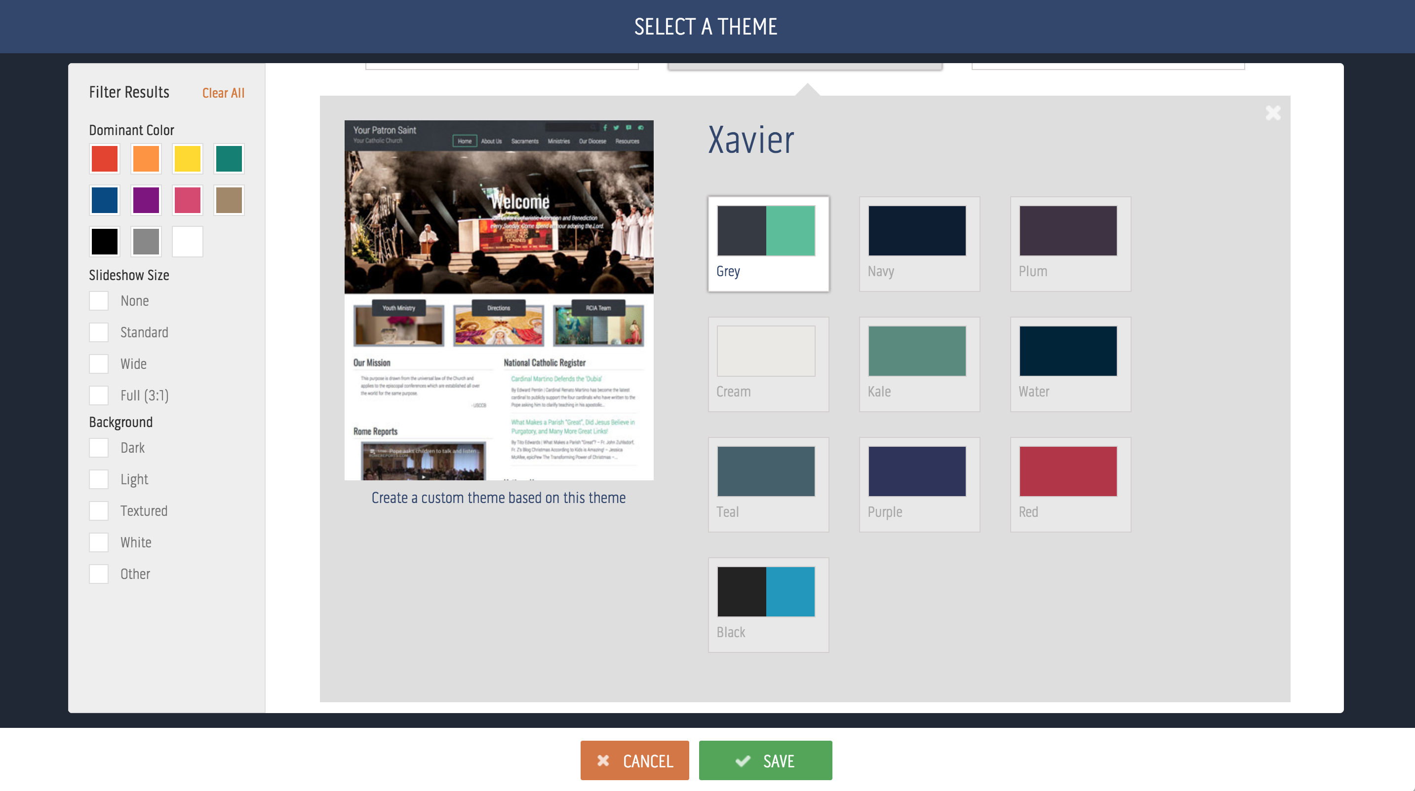
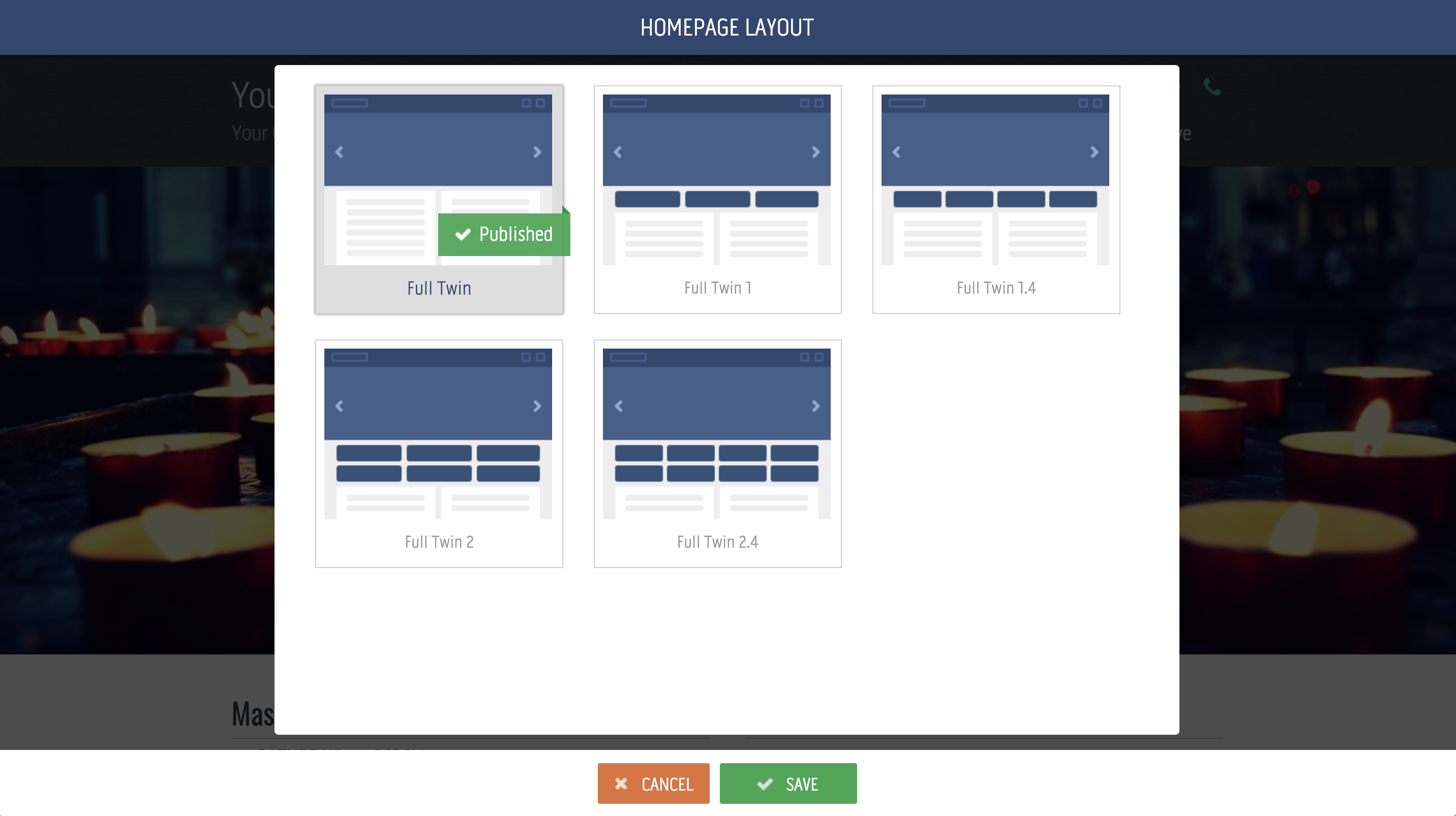
Just to clarify, the Xavier theme is a template (one of many you get with eCatholic) which means that when you first activate it, it may not look exactly like the screenshot posted above. It will initially include default images, text, colors, and fonts inside the template. It’s certainly possible to make your site look exactly like my ideal site above by adding the exact photos and layout. But it’s better if you pop in your own photos and text, tweaking your site so it’s unique and personalized.
How to get the Xavier website theme?
As I mentioned above, if you’re one of the thousands of existing eCatholic customers, the template is already available in your template library! It’s free and you can start using it right away.
If you’re not an eCatholic customer, you get the theme free when you sign up for one of their hosting plans. Web designers would typically charge anywhere from $5,000 – $10,000 to design and code a site like this, but you can get it today when you join eCatholic for just $20, $35, or $50 per month, depending on the plan you choose.
The best way to sign up is to begin a free trial so you can play around with the template. If you don’t like it, no worries. You can cancel at any time during the first 30 days without spending a penny.
But I have a hunch that once you get into eCatholic and start using this awesome theme, you’ll quickly see how simple and elegant the service is.
You’ll discover what hundreds of parishes already know, that eCatholic will raise your ministry to the next level and ensure that the first impression people have of your parish is a great one.
Click here to start your free eCatholic trial!
(NOTE: If you sign up with eCatholic using any of the links above, I will earn a small commission. But I would promote eCatholic even if I didn’t earn a dime. I genuinely believe they’re the best website option for most Catholic parishes in the country. I’ve been using and recommending them for years.)